Problems & User Needs:
This case study documents the research-informed redesign of a children’s storytelling platform—a digital space where young readers aged 6–12 discover stories and budding writers aged 7–17 contribute their own work. The project addressed critical usability issues that were suppressing engagement and making it difficult for families to get the most out of the platform.
Audience
Readers: Children aged 6–12, browsing and reading stories across genres
Contributors: Young writers and artists aged 7–17, submitting original stories and artwork
Parents & Educators: Adults guiding children’s reading choices and managing content uploads on their behalf
Business Goals
Improve discoverability of stories by genre, age group, and theme
Encourage repeat visits and sustained community engagement
Build a maintainable, CMS-driven design system for future content expansion
Key Pain Points Identified:
Navigation Depth: Overly deep navigation structures buried new stories, with analytics showing 60% of users dropping off before reaching “Read More” on story listings.
Visual Inconsistency: Styling varied significantly across author pages and story previews, eroding trust and cohesion.
Missing Age Signposts: There were no clear visual cues to help parents and children identify age-appropriate content at a glance.
Broken Upload Flow: Parents attempting to upload content on behalf of their children found the process confusing and frequently got lost, unable to place submissions in the correct section of the site.
Design Process & Methods Used:
Research & Discovery
Research was conducted with real families to understand how children and parents actually interact with the platform. The approach combined hands-on usability testing with in-depth contextual interviews to capture both behavioral patterns and subjective attitudes.
Methodology
Participants: We recruited 2–3 children (within the target age range) along with their parents to participate in the study. Working with family units allowed us to observe the natural dynamics of how children and adults collaborate when browsing and contributing to the platform.
Usability Testing: Each family participated in moderated usability testing sessions where children and parents were given key tasks—such as finding a story in a specific genre, exploring author profiles, and uploading a new story submission. Sessions were observed to identify where users hesitated, made errors, or abandoned tasks entirely.
Contextual Interviews: Following the usability tests, contextual interviews were conducted with both children and parents. These conversations explored what participants thought of the overall design, how intuitive they found the experience, and what would make them want to return. By conducting interviews immediately after hands-on use, insights were grounded in fresh, concrete experiences rather than hypothetical preferences.
Key Insights
From Children
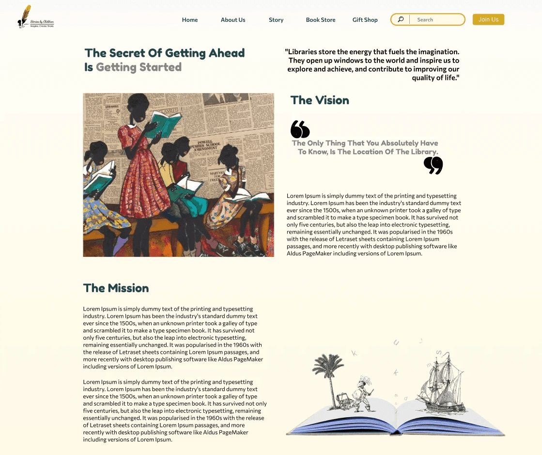
Colour and Vibrancy Matter: Children consistently responded more positively to colourful, vibrant design choices over plain white or minimal layouts. The visual richness of the interface directly influenced how “fun” and inviting they perceived the platform to be.
Recognition and Visibility Drive Engagement: Children expressed excitement at the idea of having their pictures or profiles displayed on the website—particularly as “winners” or featured contributors. Being visibly celebrated on the platform was a strong motivator.
Social Connection Fuels Exploration: Children were far more likely to engage with content created by other children, especially when those contributors were friends or someone they recognised. Peer familiarity served as a powerful discovery mechanism and trust signal.
From parents
Content Upload Process Was Broken: Parents consistently struggled with the upload workflow. They found it difficult to place content in the correct section of the website and frequently got lost navigating the submission process. This was identified as a critical barrier to contribution.
Need for Clear Guidance: Parents wanted more transparent cues about where their child’s submission would appear and how the review process worked, reducing anxiety about the experience.
Define
Insights from research were synthesised using affinity diagramming in Miro, clustering findings into three core themes: quick access to content, visual cues for age-appropriateness, and social proof through peer visibility.
Problem Statements
“Readers need a one-click way to find age-appropriate stories so they can start reading without adult help.”
“Parents need a clear, guided upload process so they can submit their child’s work without getting lost.”
“Young contributors want to see themselves celebrated on the platform so they feel motivated to create and share.”
Personas
Curious Reader (Age 6–9): Drawn to colourful illustrations and familiar faces. Browses visually and gravitates toward content from friends or recognised contributors. Needs vibrant, image-forward interfaces with minimal text-heavy navigation.
Aspiring Author (Age 10–14): Motivated by recognition and community. Wants to see their work featured and receive feedback. Relies on parents for the technical aspects of submission.
Supportive Parent: Manages uploads and monitors content suitability. Needs a streamlined submission flow with clear confirmation of where content will appear and how it will be reviewed.
Design & Development
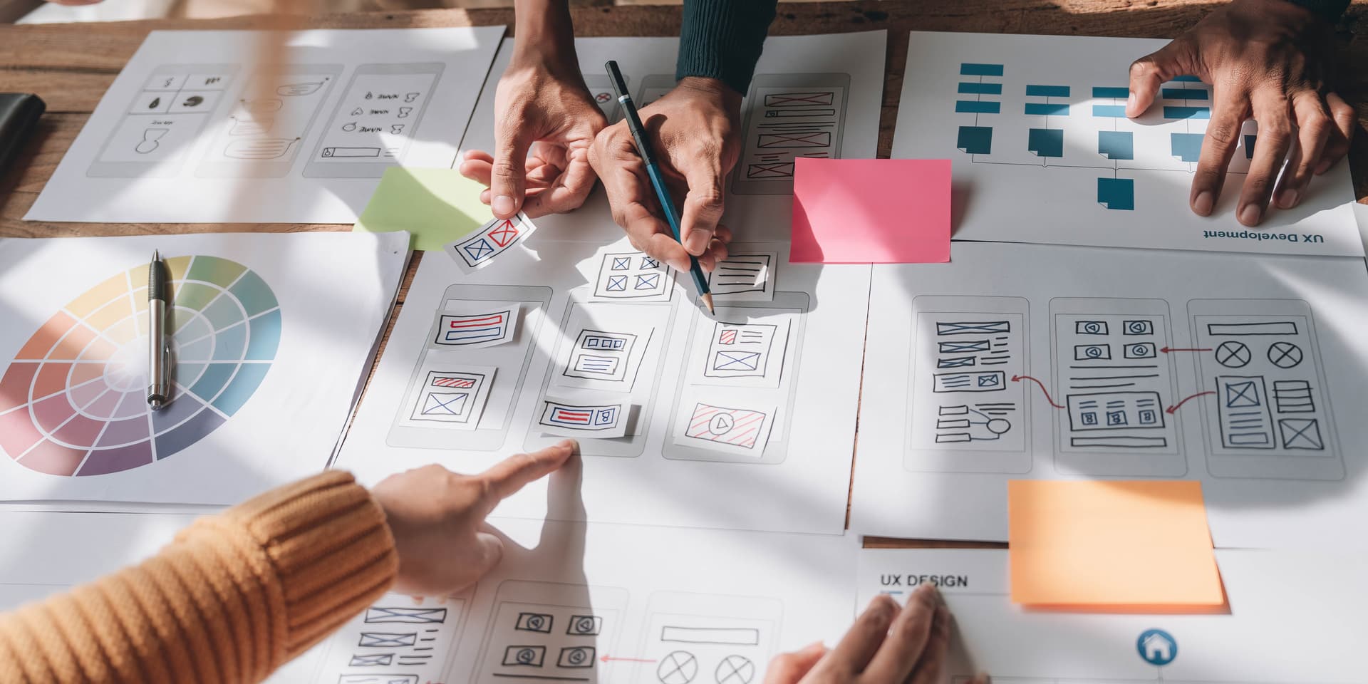
Ideation
Sketching workshops with stakeholders produced 30+ layout concepts for the homepage and category pages. Concepts were evaluated against the three research themes (quick access, visual cues, social proof) to shortlist directions for prototyping.
Design System (Atomic Design in Figma)
A scalable component library was built following atomic design principles to ensure visual consistency and maintainability:
Atoms: Buttons, icons, colour tokens, and typography scales—featuring the vibrant, child-friendly palette validated through research
Molecules: Story cards (with age-group badges), author badges with profile photos, and contributor spotlight tiles
Organisms: Genre filter panels, “Featured Winners” carousel, streamlined upload wizard, and responsive header
Key Design Decisions Informed by Research
Vibrant Visual Language: Replaced the previously minimal, white-heavy aesthetic with a colourful, illustration-rich design system that children responded to positively in testing.
Contributor Spotlights: Introduced prominent “Winners” and “Featured Authors” sections displaying children’s photos and names, directly addressing the desire for recognition.
Peer Content Discovery: Added “Stories by Kids Like You” and friend-based recommendation surfaces, leveraging the social connection insight.
Redesigned Upload Flow: Completely restructured the content submission process into a guided, step-by-step wizard with clear progress indicators, category selection, and preview confirmation—resolving the critical parent pain point.
Age-Group Visual Signposts: Colour-coded badges and section headers provide instant clarity on content suitability without requiring deep navigation.
Prototyping & Validation
Clickable prototypes were built in Figma and tested through moderated usability sessions. Key tasks included “Find a Sci-Fi story for your age” and “Submit your own story.” Two rapid Lean UX sprint cycles of feedback and adjustment improved task success rates from 50% to 85%.
Delivery & Handoff
Developer Handoff
A comprehensive Figma component library was published with detailed specifications including contrast ratios (WCAG AA compliant), responsive breakpoints, spacing tokens, and CSS custom properties. Every component was annotated with interaction states and accessibility notes.
CMS Integration
Components were built to bind directly to CMS fields—title, age group, cover image, author profile—enabling non-technical staff to add new stories and manage featured content without design or development support.
Metric | Result | Detail |
|---|---|---|
Page Views | +40% | Increase in first month post-launch |
Story Submissions | +25% | Upload from young contributors |
Task Success | 50% -> 85% | Improvement across usability testing |
Category Exploration | 70% | New Users Exploring 2+ categories per session |
Upload Completion | Resolved | Parent submission flow streamlined end-to-end |
Post-Launch Monitoring
Heat maps and event-tracking were implemented to continuously validate engagement patterns. Early data confirmed that the contributor spotlight sections and peer content feeds are among the most-interacted elements on the platform.
Next Steps:
Expand international reach with multi-language support and culturally diverse content libraries
Develop advanced filtering by reading level and learning objectives to support educators
Build community features for peer feedback, comments, and collaborative storytelling
Integrate enhanced accessibility features for children with diverse needs (screen reader optimisation, dyslexia-friendly fonts, high-contrast modes)
Conduct follow-up research with a larger participant pool to validate patterns at scale and uncover additional needs